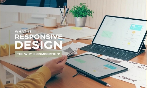
With the increase in mobile usage, responsive assets have become essential for modern web design. They enable websites to display images, videos, and other media optimized for various screen sizes, from smartphones to desktops. Hamood Tech utilizes responsive assets to enhance website performance and ensure seamless user experiences across all devices.
Responsive assets refer to media elements—such as images, videos, and graphics—that adapt based on the user’s device, screen size, and resolution. This ensures that content is displayed optimally without sacrificing quality or causing slow load times. Implementing responsive assets goes beyond resizing; it involves optimizing each asset to meet device-specific requirements.
Improved Loading Speed:
Large, unoptimized media files can slow down websites, particularly on mobile devices with limited bandwidth. Responsive assets adjust file sizes and resolution based on the user’s device, reducing load times and enhancing performance.
Enhanced User Experience:
Responsiveness ensures that users see clear and properly scaled images and videos, no matter what device they’re using. This eliminates awkward zooming or scrolling and leads to a smoother browsing experience.
Better SEO Performance:
Search engines favor websites that load quickly and provide mobile-friendly experiences. By implementing responsive assets, your site not only improves user engagement but also gains SEO advantages.
Future-Proof Design:
With responsive assets, your site is ready to adapt to future devices with different screen resolutions, keeping it relevant and visually appealing for new technologies.
At Hamood Tech, we integrate responsive assets as a core part of our development process, optimizing media to enhance performance and ensure user satisfaction. Our team uses the latest tools and techniques to create adaptable, visually stunning websites that provide seamless experiences on any device.
Responsive assets are essential for improving website performance, reducing load times, and enhancing user experiences. Hamood Tech leverages responsive design strategies to optimize images, videos, and other media, ensuring our clients’ websites are both visually appealing and highly functional across all devices.